Okay, so to continue where Tabula Rasa pt 1 left off, here are more tips to help you get started decorating your place:
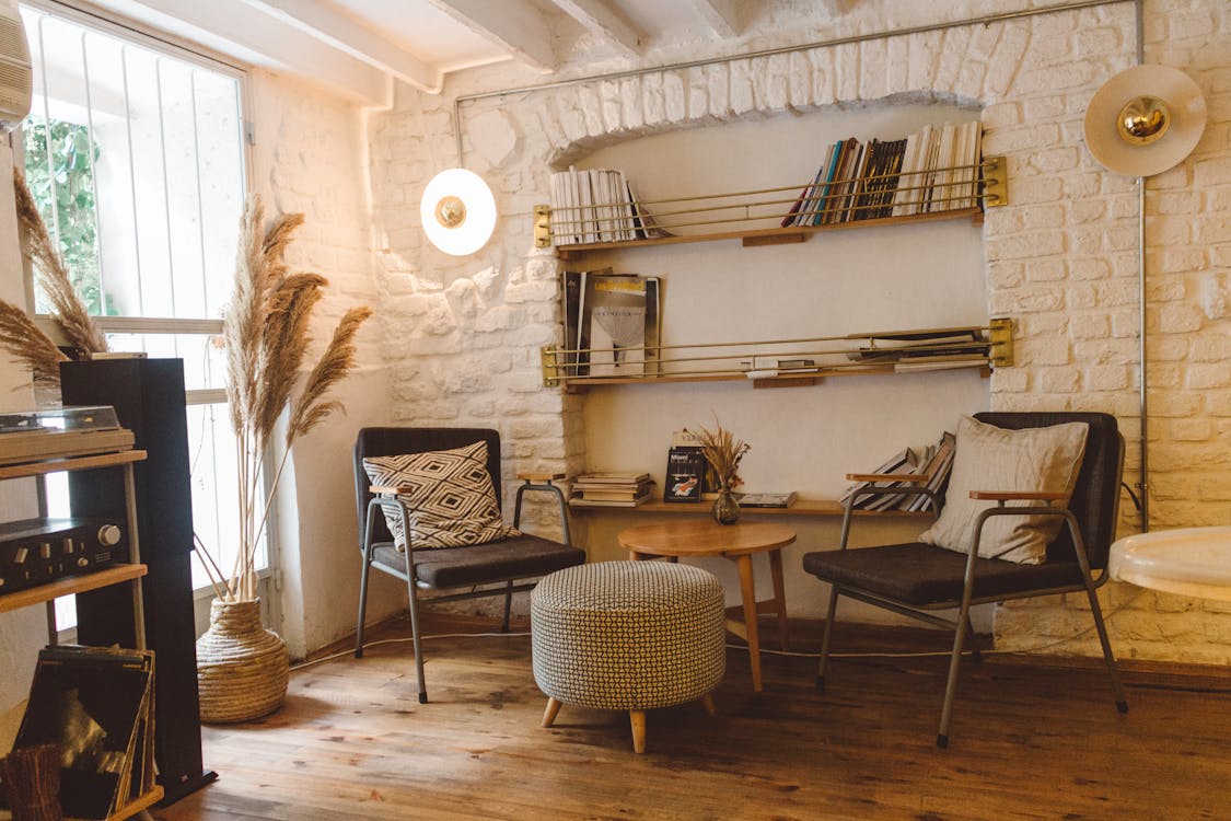
6. Respect the building. Anyone who's read this blog before knows what I think of people who move into historical buildings, gut them, and replace the interiors with contemporary features. Not only is it anathema to destroy something that can never be replaced, but it doesn't make sense from a design perspective, either. Is there anything more jarring than being confronted with an ultra-modern interior in a Victorian building? Or how about gingerbread trim on a 1960s bungalow? I've seen both far too many times. If you respect the inherent nature of the building you live in and decorate accordingly, you're halfway to having a great style right off the bat. And if you insist on having an interior that clashes with the architecture, at least keep it limited to furnishings and artwork. Once mouldings and woodwork are gone, they're not coming back.

7. Enhance existing architectural details and minimize flaws. This requires some creativity, especially if your budget is limited. For example, you've got great floors? Leave them uncovered. Stuck with ugly broadloom? Cover with area rugs (but not before first checking to see if you've got great floors hidden underneath!) Beautiful wood trim? Leave it (wood is naturally attractive and paint is just about impossible to remove). Cheesy 1970s "wood" panelling? If you can't remove it, find out if there's a way to paint it, or cover it with fabric, or hide with large furniture and artwork, or--if there's no alternative--go with a 1970s look in the room and call it retro. It helps to have some appreciation for imperfections, as well.

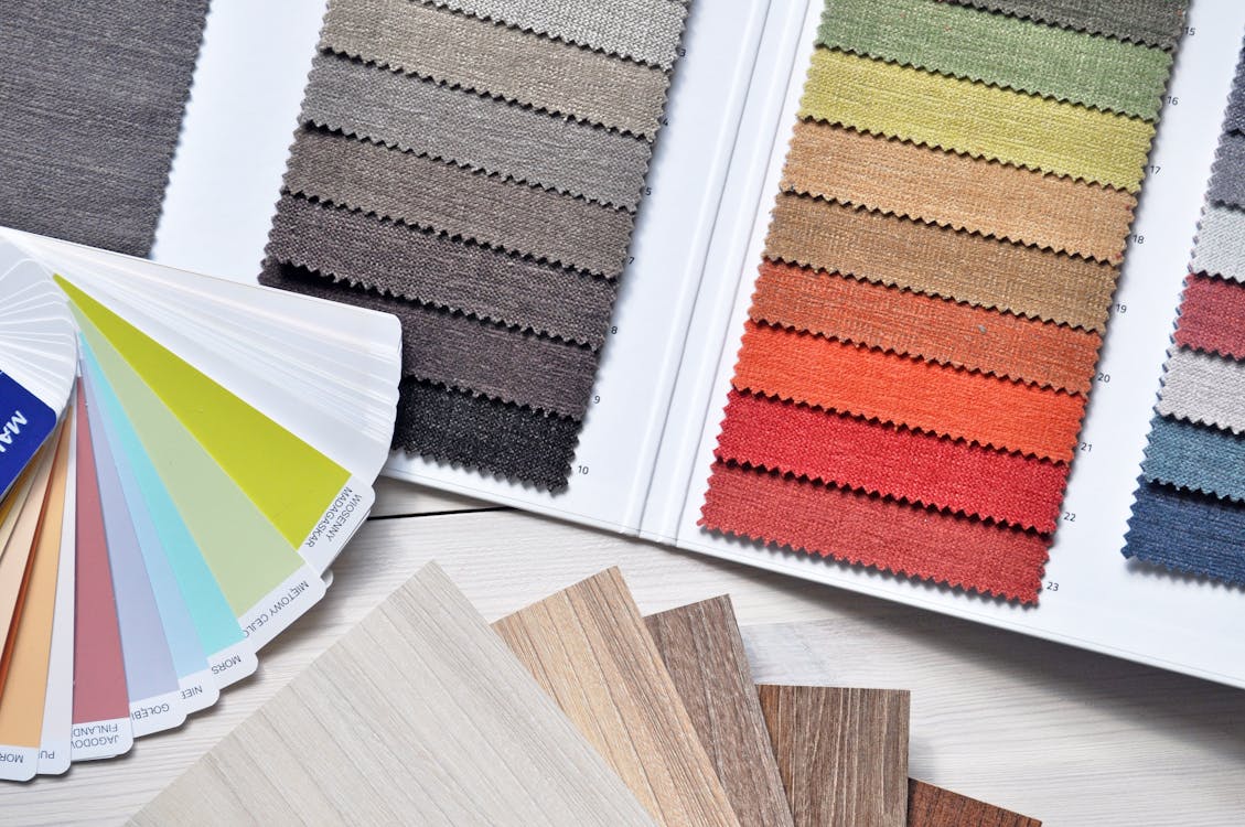
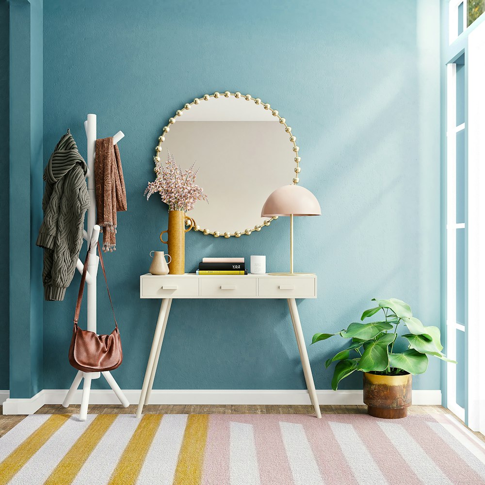
8. Don't fear colour! Sorry--white and beige are not ideal neutral backdrops to your decor; they're overwhelmingly boring and lacking in personality. For the minority who really do enjoy being completely surrounded by lack of colour, carry on. For everyone else who is just too scared to experiment, take comfort in knowing that painting is neither difficult nor overly expensive. There's lots of books, sites, pamphlets, and people around who can help you with technique and colour choice. Spending some time (not a lot--it's not rocket science) reading up on colour theory should help even more. And a good rule to remember is to keep ceilings and floors neutral--that way your rooms won't be overpowered by colour. You can always start with just a wall or two and go from there. The best thing about paint is that if you get bored or don't like it, you can change it again.

9. Speaking of your walls, don't neglect to hang art, by which I don't mean only original works by well-known artists. Art can also consist of anything from a nicely framed print or poster to decorative architectural pieces to vintage advertising signs to your own craft projects to pretty much anything you like and can hang on a vertical surface. Frankly, it's depressing to go to someone's home and be confronted by bare walls. Imagine what it's like living there! And for those of you who can't put holes into the walls, there are all kinds of new hangers available that don't damage surfaces. Consider empty spaces to be your blank canvas. Oh, and on a related note, don't destroy books by ripping out the plates and illustrations. Cheap--appropriate--sources of attractive artwork are readily available. If you really love something you've seen in a book, check to see if it's available elsewhere. If not, consider taking it to a printer and having a poster made.

10. Don't get too kitschy with themes. Yes, themes are great, but nothing ruins them faster than getting too literal with them. A beach theme can be achieved with colours and materials (say, rattan and opaque glass) rather than seashells glued to the walls and mermaids on the tiles. Look for the basic elements of your theme of choice and incorporate those, rather than over-the-top obvious representations. Do you think anyone in Paris has an Eiffel-tower lamp at home? When it comes to themes, you want to show, not tell. Don't forget to come back for my final tips in Tabula Rasa pt 3!
[Edited for formatting, to update link, and to add photos. Follow me on my official site: AspasiaSBissas.com]


No comments:
Post a Comment